Multispectral Analysis of NAIP Data in Seattle
General ·Visualize and quantify multispectral aerial imagery data by neighborhood in Seattle, WA.
Data Choice
As I grew up in Colorado, I always expexted nature to look a little brown in hue. The outdoors in CO are beautiful, but anyone who has visited can tell you that for the most part it is brown. Of course, there is greenery, but it took me moving to Seattle in 2019 to understand just how brown Colorado was.
Seattle’s nickname is Emerald City for a reason. I lived there for a few years and I remember looking out the window of first apartment in the ‘Westlake’ neighborhood and realizing just how green Seattle was. Even in a major city, there was still vast amounts of greenery, that were true greens.
I moved around for awhile, and I wanted to analyze which neighborhoods were the greenest relative to still being in a large city so if I every move back I can know which neighborhood to live and spend my time in. I downloaded the neighborhood data from the Seattle Public Utilities website.
The above interactive plot details each neighborhoods in Seattle, and their sub-neighborhoods. For example, I lived in Westlake, which is apart of the Cascade Neighborhood.
Data at a Glance
NAIP Multispectral Data
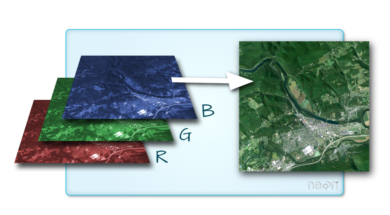
The National Agriculture Imagery Program (NAIP) provides multispectral aerial imagery data for agricultural and land use applications. NAIP typically captures data in multiple spectral bands, including Red, Green, Blue, and Near-Infrared. Some NAIP datasets may have additional bands, such as panchromatic or thermal infrared, depending on the year and location according to the NAIP. For more information on calculating NDVI, look to my NDVI post.
Since I moved to Seattle in 2019, I wanted to look at NAIP from 2019-present to see what would have been the best neighborhood to live in in the time I lived there, or if I moved back today.
NAIP data access: The data used were downloaded from the USGS Earth explorer website. There was some technical issues with corrupted data so I will updating this notebook with potentially more correct data in the future.

Data Analysis
Below are chlorpleth plots of the statistics for each neighborhood.
Maximum:
The 3 neighborhoods with the highest NDVI value for that time period would have been the greenest neighborhoods to live in:
- Alki
- Pinehurst
- Wedgewood
Minimum:
The 3 neighborhoods with the lowest NDVI value for that time period would have been the least green neighborhoods to live in:
- Industrial District
- North Beach/Blue Ridge
- Arbor Heights
Mean:
As we took any data, not just during the greenest time of the year, the mean will likely give us the best approximate as to the overall 3 greenest neighborhoods:
- Seward Park
- North Delridge
- Sand Point
Additional Data-
25th Percentile:
75th Percentile:
Standard Deviation:
Results
Overall it looks like if I want to maximize my potential greenery, I should live in Alki Beach, but if I want to live where it is more likely to be green on average, I should live in Seward Park.
It will be interesting to see how the data changes when I further investigate if there is data that is notbeing pulled correctly from NAIP’s API service.
Data Citations
National Agriculture Imagery Program - NAIP Hub Site. (n.d.). https://naip-usdaonline.hub.arcgis.com/ U.S.G.S. (n.d.). The National Agriculture Imagery Program (NAIP) Dataset. EarthExplorer. https://earthexplorer.usgs.gov/
Seattle Public Utilities. (2020). Neighborhood Map Atlas Neighborhoods. https://data-seattlecitygis.opendata.arcgis.com/maps/SeattleCityGIS::neighborhood-map-atlas-neighborhoods.
